21.10.15
이미지 삽입
- IR 기법 : image replace 글자를 대체하기 위해 이미지를 삽입하고 처리하는 기술
- IS 기법 : image sprite 여러 개의 이미지를 삽입하여 한번에 관리하는 기술
그림자 기법
- box-shadow : 요소에 그림자를 주는 기법
- text-shadow : 글자(텍스트)에 그림자를 주는 기법
- filter: drop-shadow() : 다양한 효과의 기능 중에 filter효과로 처리하는 기법
transform
- translate() : 위치이동
- rotate() : 회전
- skew() : 기울기
- scale() : 배율(크기)
- perspective() : 원근법
- perspective :
background
background-repeat:repeat;: 기본no-repeat;: 반복 Xrepeat-x;: 가로로 반복repeat-y;: 세로로 반복
background-position:0 0;: 기본right top;: 오른쪽 상단left center;: 왼쪽 가운데x축 y축;: 수치를 직접 입력해서 사용(%, px) (x y) / right, center 이런 걸로 사용 x- 퍼센트로 사용할 땐 이미지의 기준도 퍼센트에 맞게 변경
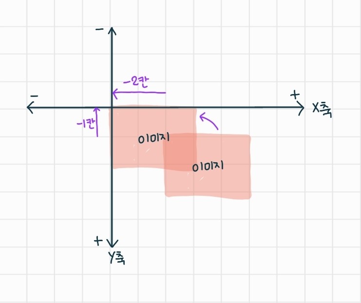
- px 사용 시 이미지와 배경 모두 왼쪽이 기준
background-position: -110px -24px;: 다중 이미지를 사용할 때 보통 -를 사용한다- 웹에서는 오른쪽으로 가야 x축 +, 아래로 가야 y축 +
background-size:contain;: 다 보이게 채워줌cover;: 가로나 세로 어디 한 부분을 맞춰줌 (빈틈없이 꽉 차게)100% auto;: 가로를 꽉 차게, 세로를 맞춰주기auto 100%;: 가로는 맞춰주고 세로는 꽉차게none;initial;: 원본 크기대로
background: url repeat position;한 줄로 사용 가능 - 복잡함- 한 번에 여러 개 이미지 처리 가능
  background-image: url("../../img/icon/arrow.svg"),
                    url("../../img/icon/chinchill.png"),
                    url("../../img/icon/cow.png");
  background-repeat: no-repeat, repeat-x, repeat-y;
  background-position: 50% 0, 50% 50%, 100% 80%;
  background-size: 20px auto, 50px auto, auto 25px;
background-image: linear-gradient();: 각도, colorA, colorBbackground-image: linear-gradient(45deg, #bbb 30%, #f50 40%, #fc0 );- : 30%까지는 #bbb 컬러, 30~45%까지
는#f50컬러, 45%이후는 #fc0 컬러
background-image: radial-gradient();: 중앙에서부터 원형으로 그라데이션 - mdn에서 찾아보기background-image: radial-gradient(circle at 100%, #af0 10%, #a70);: 오른쪽 끝에서 원형으로 그라데이션
background-attachment:fixed;: 스크롤을 하면 뒷배경이 위치에 멈춰있음scroll;
box-shadow
box-shadow: x y blur color;: 기본형 - 오른쪽 하단box-shadow: x y blur offset color;: 확장형box-shadow: inset x y blur offset color;: inset 하면 내부로 그림자 - 왼쪽 상단- 그림자 중첩 가능
-
.box_shadow_04 {
  box-shadow: 0 0 5px #999,
              -5px -5px 5px #555,
              10px 10px 3px #adf,
              inset 0 0 15px #333;
}
text-shadow: x y blur color;: 글씨에 그림자 주기- text는 offset, insert 기능 없음
- 중첩 가능
-
.text_shadow_02 {
  text-shadow: 3px 3px 0 #47a,
                10px 4px #fa0;
  color: rgba(255, 255, 255, 0.5);
}
filter: drop-shadow(x y blur color);: 이미지에 그림자 주기- offset, insert, 멀티 기능 지원 x
- filter의 다른 종류
blur(): 이미지에 블러 처리grayscale(): 이미지를 () 안의 정도만큼 회색으로 처리hue-rotate(): 20 색상환처럼 원형으로 컬러를 돌림
- 응용
-
.img_shadow_03 {
  filter: blur(10px) grayscale(70%);
  transition: all 200ms linear;
}

.img_shadow_03:hover {
  filter: blur(0) grayscale(0);
}
반응형
'취준생' 카테고리의 다른 글
| 211019 필기내용(css, overflow, visiblity, border-radius, html, form, input) (0) | 2021.11.21 |
|---|---|
| 211018 필기내용 (0) | 2021.10.18 |
| 211012 필기내용 (0) | 2021.10.18 |
| 211011 필기내용 (0) | 2021.10.18 |
| 211006 필기내용 (0) | 2021.10.08 |

댓글